
Samuel French is a theatrical publishing/licensing house founded in 1830. With their 190th anniversary approaching, SF was looking for a way to transform their digital presence into a theater hub that allowed users to license and purchase theater content in a fresh, easy-to-use and efficient manner without all of the confusion, clutter, and dead-ends this community has come to know when searching for their perfect play.
Goals
Create a best-in-class, easy to support digital experience that positions Samuel French as a global leader in theatrical licensing and publishing.
Strategy
Distinguish between licensing and retail products. Provide clients and potential clients with a more efficient, streamlined, user-friendly site that connects clients to their goals efficiently. Improve the speed and usability of licensing products.


Providing a frictionless user journey
Our top priority was reducing the number of pages on the site and providing clear paths to focus on the goal of what customers wanted. We first divided the customers into two audiences: License customers, seeking plays to license and perform and Retail customers looking to purchase show materials like scripts and sheet music. Our task would be making these unique experiences coexist on the same site.

Example of a licensable show

Example of a retail product
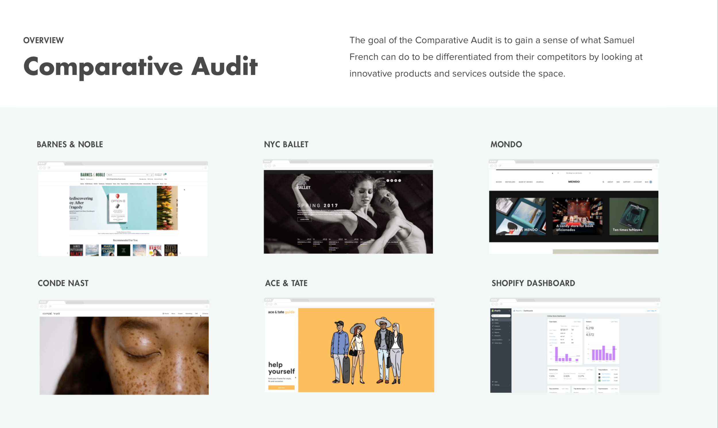
Canvasing the competitive landscape
We canvased the competitive landscape of the theater world, eventually determining there lacked a singular brand delivering on all fronts, content aesthetic and experience.
We began to look at brands outside of our immediate scope, focusing on sites that were content-heavy yet presented information clearly, all while being aesthetically pleasing and easy to navigate.

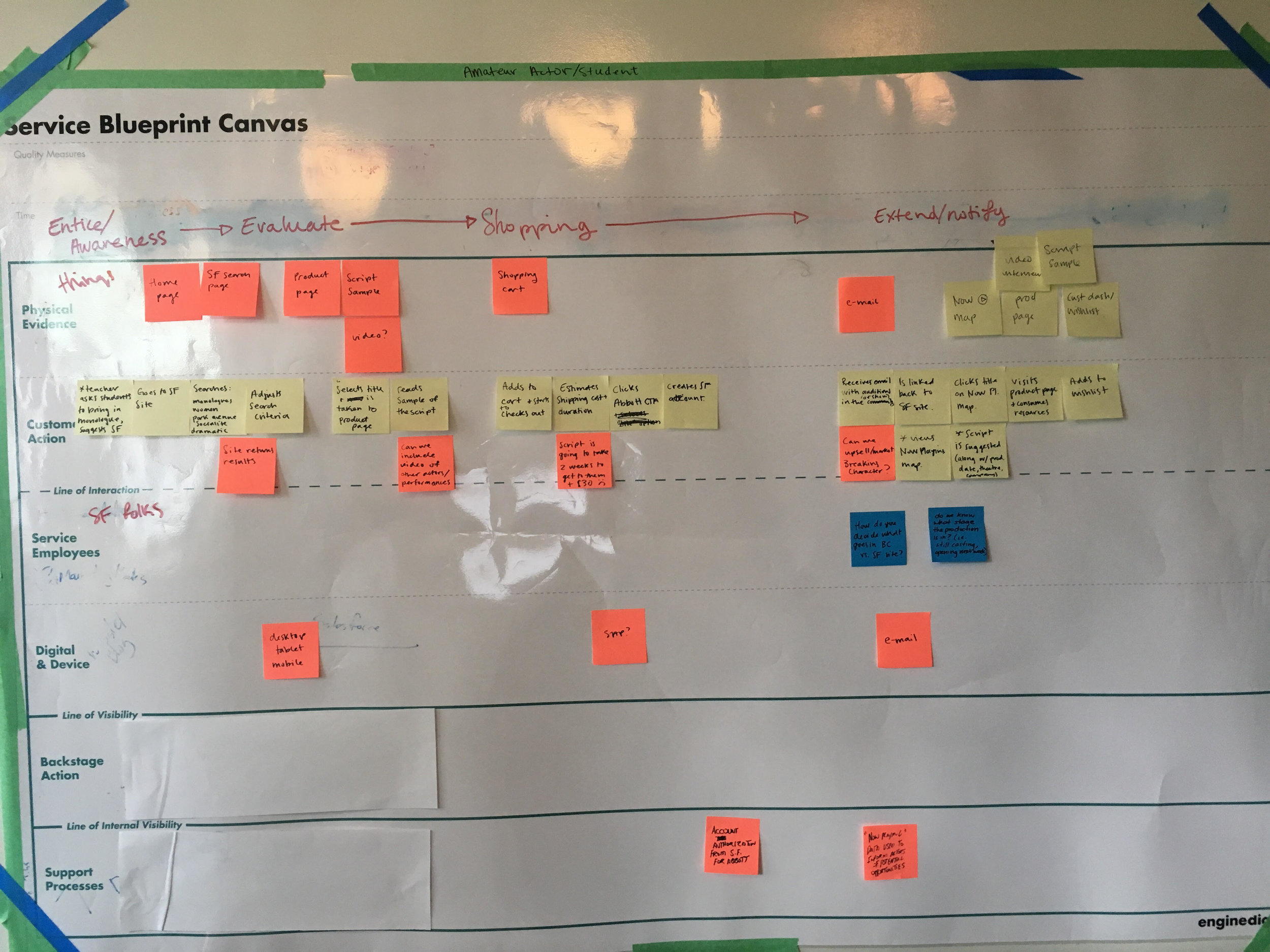
Service Blueprint Canvas
You can learn a lot from auditing a website. You can learn even more by following the journey of its users. We wanted to understand the process a user takes to achieve their goals (from their first introduction to the site, until their final purchase). Within their journey, we mapped out areas of friction that lead to dead ends and places of brand engage where Samuel French might add value to the customer's experience.
The service blueprint for us was the perfect tool for such a task. It allowed us to get very practical on what users were coming to the website for and what they weren’t. We were able to ask the tough questions to our client about the use of specific components and receive client buy-ins to experiment with ideas that might improve the overall site quality.

Solving complex problems with Google Sprints
For our team, one concern that continuously plagued us was the confusion around finding and licensing plays. For one, the process was complicated and for many customers, they preferred to call the company directly to avoid the hassle. Additionally, even after users went through the entire process, there was no guarantee they would receive the license due to a complicated approval process.


We decided our sprint should focus on creating an enjoyable experience for finding titles to license while inviting users also to explore the entire catalog.

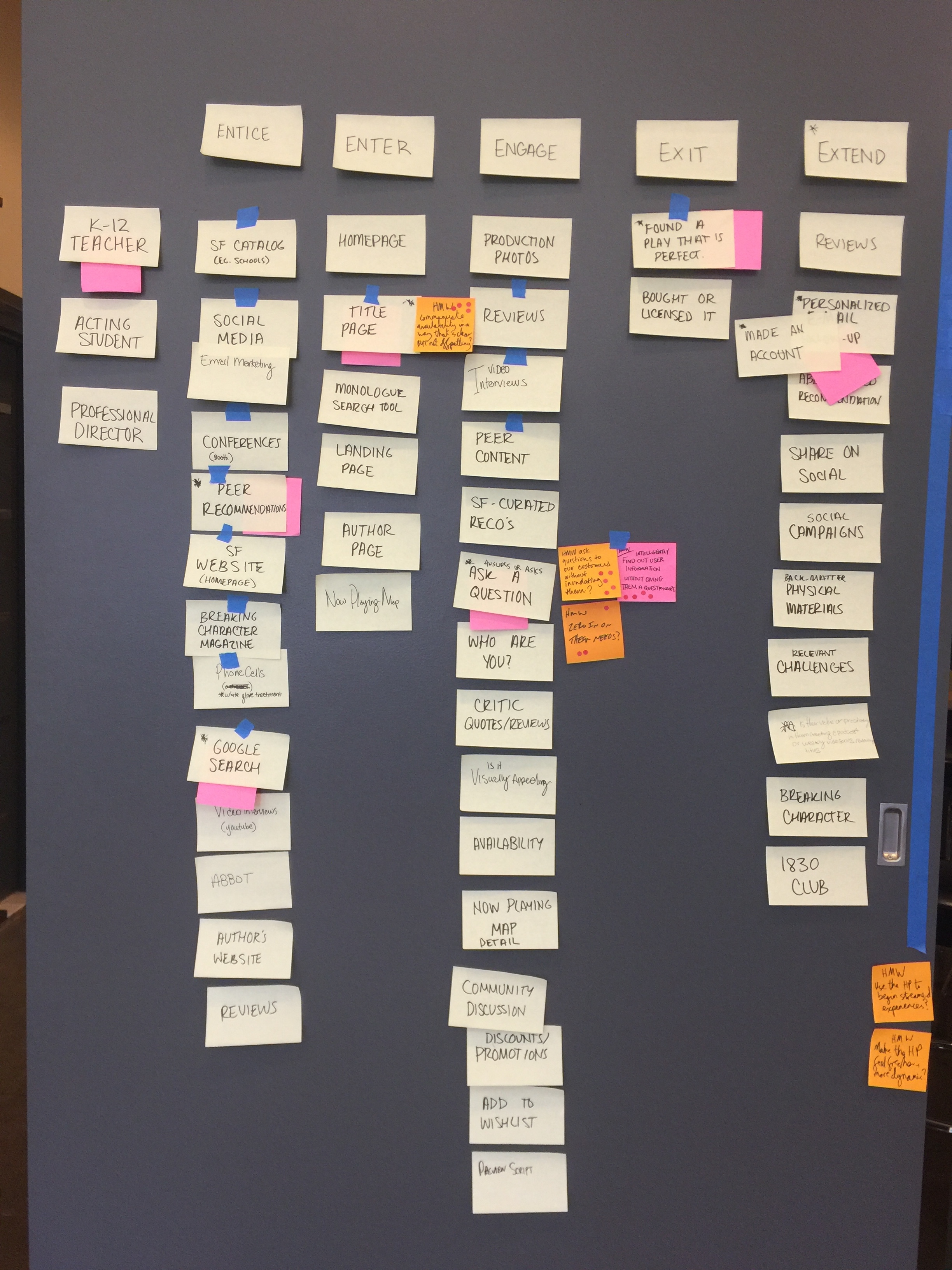
Finding the Source of Truth
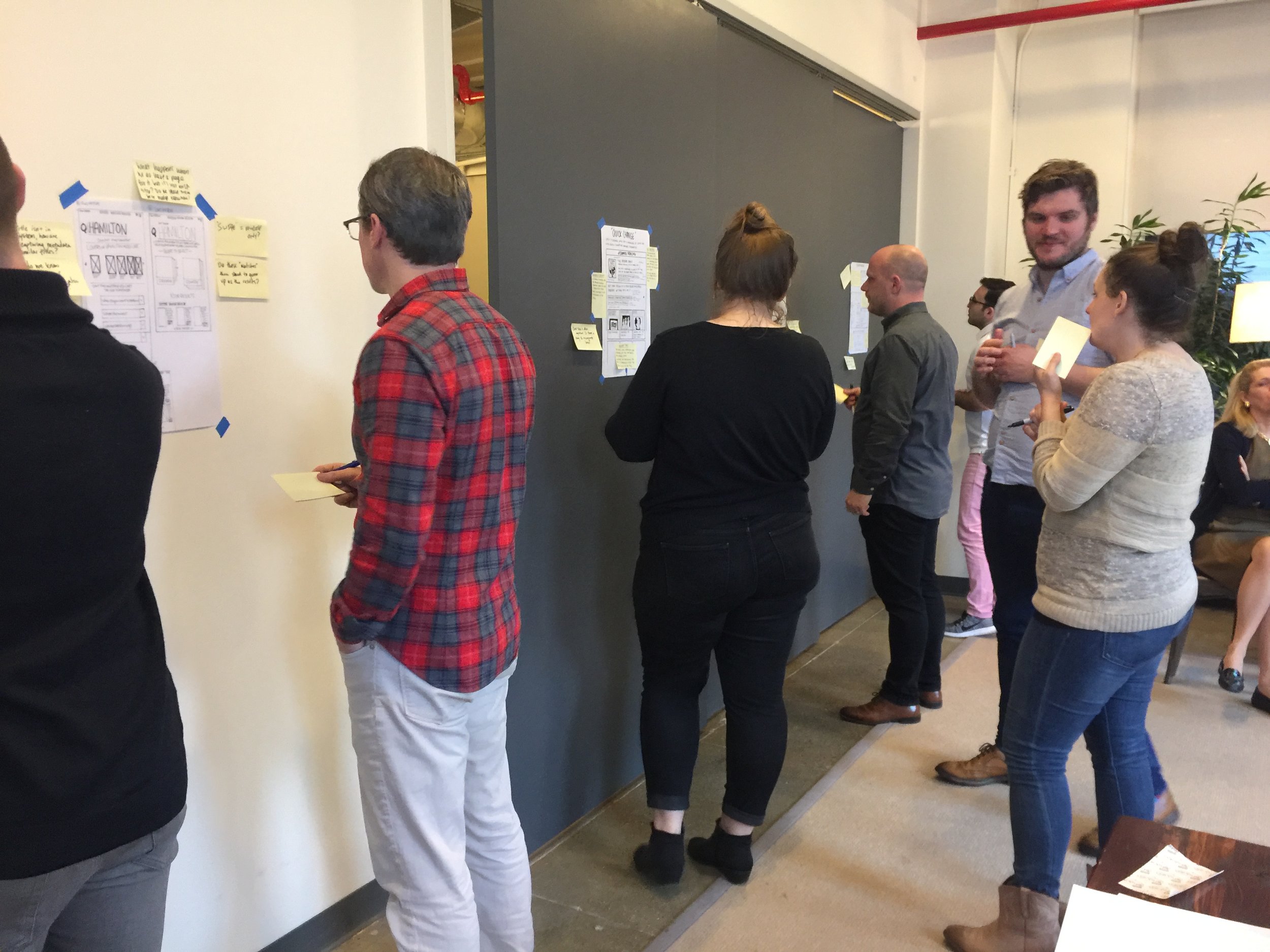
We then mapped out a path through the user's journey and determined a target based on the path that we know the least information on that will affect the most users. We used this as the basis of our sketches during the lightning demos. Our ten stakeholders were tasked with voting on the components/features they enjoyed best from our three sketches. The top features would then merge in a high fidelity prototype governed by usability goals to be tested on real participants.

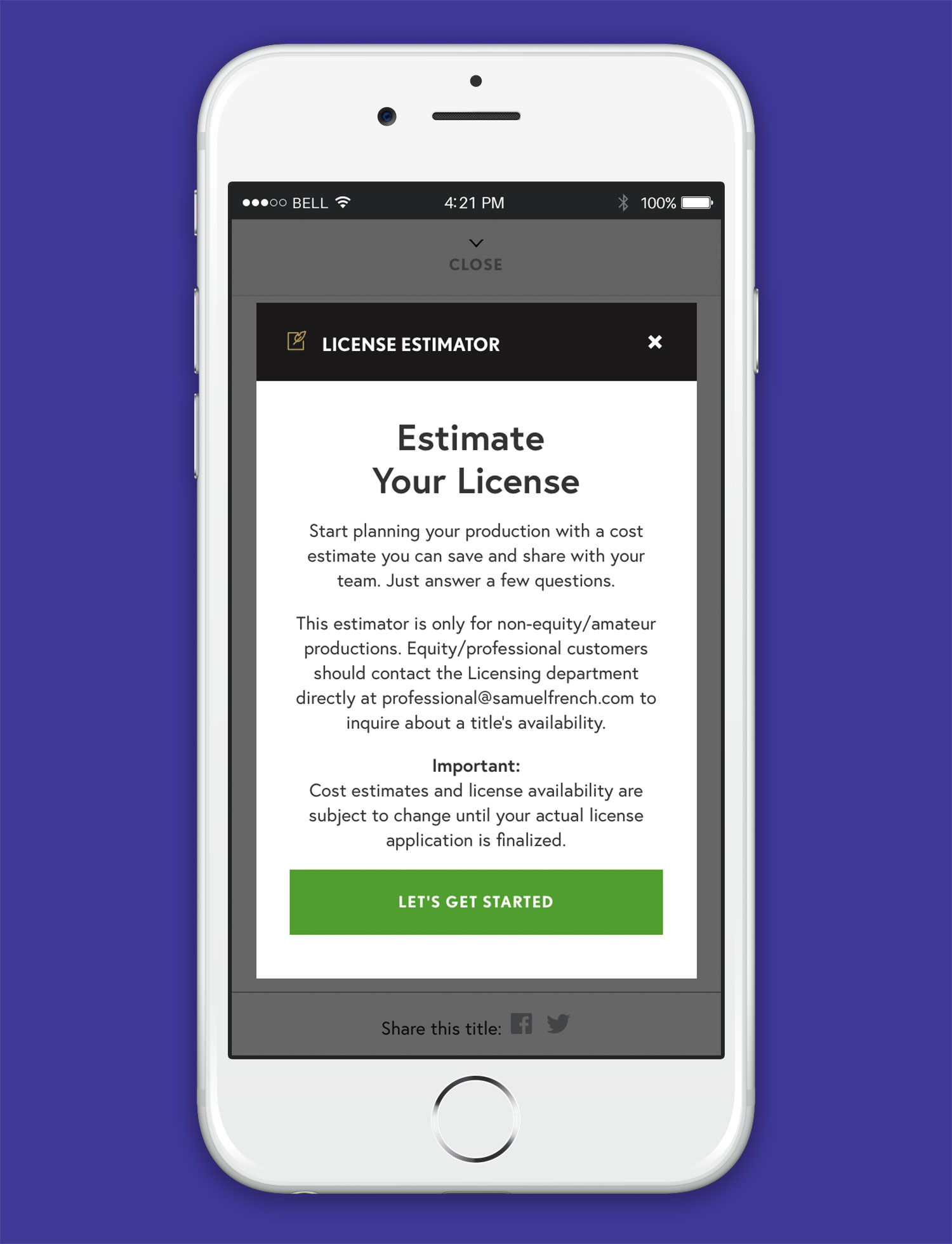
Building a better estimator
Through our sprint insights, we realized the current licensing experience forced users to make decisions far too early. Many customers we interviewed were not decisionmakers within their organization. They used SamuelFrench.com to gather information on available plays that would be shared with a larger group in charge of making decisions.
To provide a better solution, we created a license estimator. By entering just a few questions, users can find out whether or not they're eligible to perform a specific play. This allows customers to instantly check the status of multiple plays on their list in a fraction of the time.

Streamlining the product
We streamlined the experience of both catalogs. Shows are now categorized into curated groups such a Featured Collections and Plays by Women. Shop and perform artwork is now clearly distinguished from one another, removing confusion around the type of show users are discovering. Search was to each landing page giving users a defined area to find the plays they're looking for in an instant.
In building this site, we realized that each page should not have a static look and feel, each should be modular. To that end, each landing page is comprised of several widgets, allowing SF to swap out content in an instant.
The perform catalog was redesigned to include performance artwork from the shows as well as title recommendations from Samuel French's expert staff.

The shop catalog redesign makes it simple for users to find research and purchase products from their favorite stores in just a few easy steps.
